Trinity Church
Challenge
With a focus on serving its congregation and community, Trinity Presbyterian Church strived to meet every need of every audience. As each ministry added more content and pages over time, Trinity realized it had gradually pieced together a difficult website for users to navigate and find the information they needed.
Approach
SHERPA recognized the Trinity website would benefit from a user experience (UX) approach and content strategy. The goal aimed to align stakeholders, identify Trinity's key audiences and their needs, and craft a clear message with robust calls to action.
Results
Applying UX best practices and drafting a content strategy based on the church's primary audiences, SHERPA assisted Trinity with creating a more straightforward navigation and site structure that easily supported audiences through their journeys to their desired calls to action.
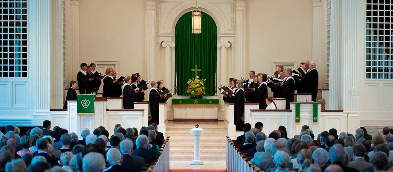
No matter where you are on your faith journey, there's a place for you at Trinity Presbyterian Church in the Buckhead neighborhood in Atlanta. In addition to serving members and visitors, Trinity also supports its surrounding community as a polling place and with its recreational spaces and offers an early learning center and a preschool.
SERVICES
Analytics Research / Competitive Analysis / Content Design + Strategy / Customer Journey Map / Information Architecture / Performance / Stakeholder Alignment / Technology Audit / UI Design / UX Best Practices
OVERVIEW
Trinity Presbyterian Church practices an evangelism of intentional welcome and hospitality, inviting all into an inclusive fellowship characterized by authentic relationships and mutual respect. As a community led by Spirit, it seeks to make God's love visible, which extends to its website.
Challenge
With its evangelism of intentional welcome and hospitality, Trinity Presbyterian Church serves a diverse membership through its worship, ministries, programs, and services, such as weddings and funerals—in addition to attracting visitors and supporting their local community.
To support these audiences, staff added more content and subpages until the site became so cumbersome that users could no longer find the information they needed and left the website frustrated. Their digital experience could have provided the intentional welcome and hospitality crucial to their mission, but it failed.
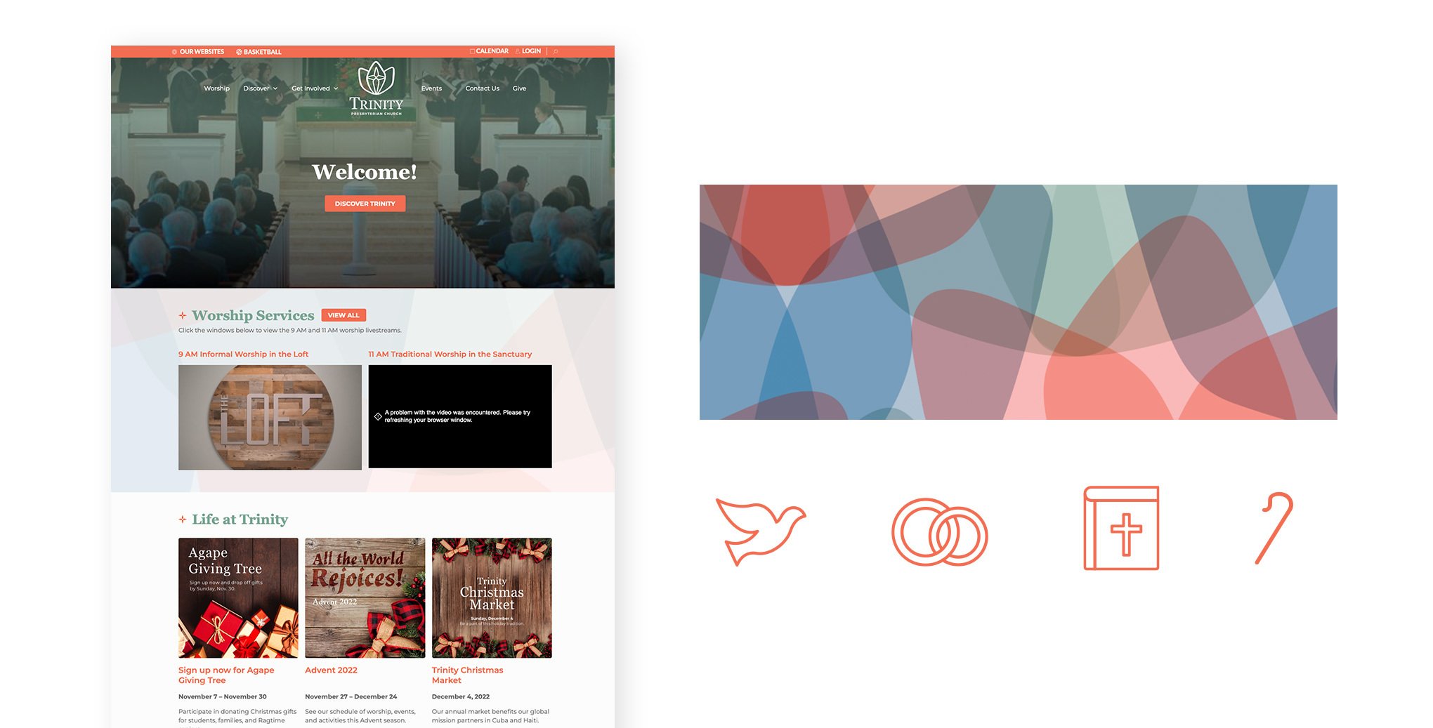
Partnering with SHERPA, Trinity Presbyterian Church asked for a thoughtful redesign of their WordPress website that would be easier for their users to navigate and for staff to manage. Their site also needed to be welcoming, engaging, and authentically represent Trinty Presbyterian Church.

Approach
SHERPA knew with all the cooks in the kitchen, it needed to align Trinity Presbyterian Church's stakeholders. Guiding them through a discovery workshop with a UX perspective, SHERPA identified the following creative brief:
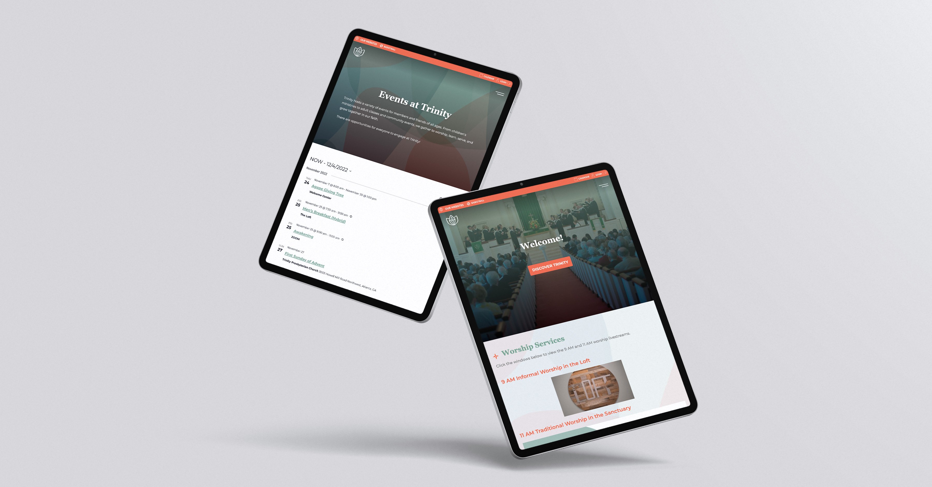
Improve navigation and findability of essential information
Increase member engagement
Create a clear, concise customer journey for visitors
Show an aesthetically pleasing, authentic, welcoming online experience
Demonstrate what Trinity Presbyterian Church offers visitors, members, and community
SHERPA reviewed Trinity Presbyterian Church's analytics and noticed that users quickly left key pages where Trinity anticipated users would have spent more time. Leveraging its UX content strategy experience, SHERPA suspected users struggled to figure out the navigation to find the information they needed. SHERPA conducted a card sorting exercise with members, visitors, staff, and others to discover the language they used, the information they expected to find, and how they grouped it.
Keeping the audience journeys in mind, SHERPA analyzed the card sorting data and designed a navigation and site structure that more closely matched user expectations.
A UX content audit revealed most of the content as nonessential and a distraction from the essential information users wanted and needed to find. SHERPA collaborated with Trinity Presbyterian Church to devise a content strategy that noted where to revise and repurpose content. In addition. SHERPA worked with Trinity Presbyterian Church to write copy that shared Trinity's spirit and what they offer visitors, members, and the community.
Finding value in a clear, concise user journey is impossible if the destination doesn't include an ask, so SHERPA recommended calls to action (CTAs) on critical pages to increase engagement.
Inspired by Trinity Presbyterian Church's visual style guide and messaging, SHERPA fashioned a stunning visual design that captured Trinity's genuine, welcoming spirit.
Results
Since the redesigned trinityatlanta.org launched in April, Trinity Presbyterian Church reported that comments from members, visitors, and the community have indicated it met its success goals.
Subjective feedback aside, analytics also support the success of the project. Users, new users, and sessions have increased by 33% over the same period last year. Page sessions are up by 24%, and the average duration of sessions has risen by 17%. Although the bounce rate has gone up overall, it's still on the cusp of excellent and roughly average. However, the bounce rate is low on the key pages where users are anticipated to spend more time and higher on the pages where they're confirming the date of an event, checking an address, or getting a staff member's email or phone number, which is expected.
OUR CLIENTS SAY THAT WE R.O.C.K


Thank you for contacting us!
We appreciate you sharing with us what you are trying to achieve. We will contact once we review your information. In the meantime, we sent you a copy of your submission to your inbox.
Ooops, captcha error!
Ooops, something went wrong!
Please try again, if you still are having trouble contact us directly at webmaster@sherpaglobal.com.
How Can We Help You?
Can't find what you need?
Call us at (404) 369-0219.
Can't find what you need?
Call us at (404) 369-0219.